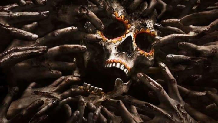
With San Diego International Comic-Con fast approaching, Fear the Walking Dead released a poster for season 2B in a style that is different from we’ve seen before.
Fear The Walking Dead seems to be taking a more artistic approach to some of the posters and key art for the show. We saw the skull in the sunset and clouds in one of the past posters.
Some of the original teasers showed characters who were never part of the show. They were just ordinary people grocery shopping or playing ball, skateboarding or lounging in a pool and shadows of walkers would loom.
We had some art at the beginning of season 2 that was very hopeful and sunny of the characters and other photos that were dark with characters melting into the dark water with their reflections melding into other characters.


The poster for 2B is by far the most symbolic and culturally relevant for the place and time in the show with the burning of Celia’s ranch and her perspective on death as one of an extreme of the Mexican attitude.
I would venture to guess that even in a culture such as the Mexican or Latino culture where death is looked at very differently, they would still kill the zombies. Daniel finds Celia and her place evil and so did the parish priest.

The art is beautiful to me, but I think it will be received with mixed reviews because it is so artistic and art is so subjective. I find the calavera (skull) mask from El Día de Los Muertos (Day of the Dead) symbolizing death that will come to all of us beautiful.
Related Story: Day of Dead Art and Zombies
The zombies are reaching for it not as literal food, because it is an art piece, but as symbolic food for them. Zombies don’t judge who they choose for food and death does not judge. It comes for all.
That is a big theme of the mask of Death in Day of the Dead. It mocks death. It mocks the riches of this world. Death does not care how rich or popular or important you are on Earth. It comes for us all.
The other thing I find beautiful about this artwork is it is a combination of Day of the Dead and the Don’t Dead, Open Inside doors in The Walking Dead. Death is both trying to get in and trying to get out.
Next: What do Undead Walking writers want to see in the Comic -Con Season 7 Trailer?
The ugly fingers are trying to get their food to sustain themselves. But a new zombie is in there. It fights not to let death in. But once it’s in, the zombie fights to come out. To not be fully consumed so he can join them.
